People don’t really like to click on ads. In fact there are many tools out there that banish ads completely, meaning advertisers have had to get a little more creative in how they present their advertisements.
Banner advertising is the traditional form of digital advertising. But that doesn’t mean customers are any more willing to click on banner ads, which reduces your potential for exposure and much needed promotion. What is a business to do?
The trick is to make your banner ad irresistible to customers who see it. In a more cynical digital age that can seem difficult, but really all you need are some tips on creating a more effective banner ad for your business. Here they are.
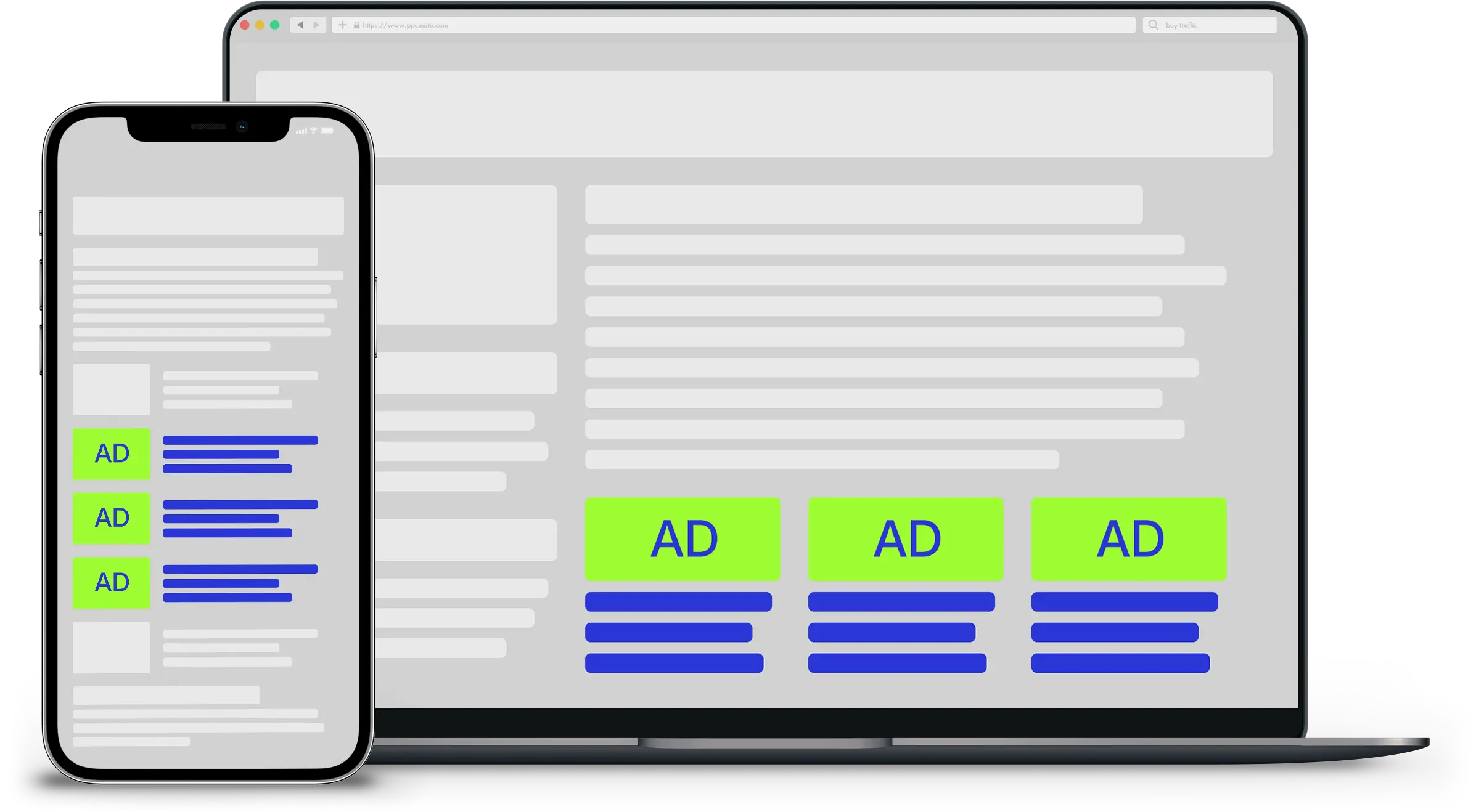
Know your sizes.
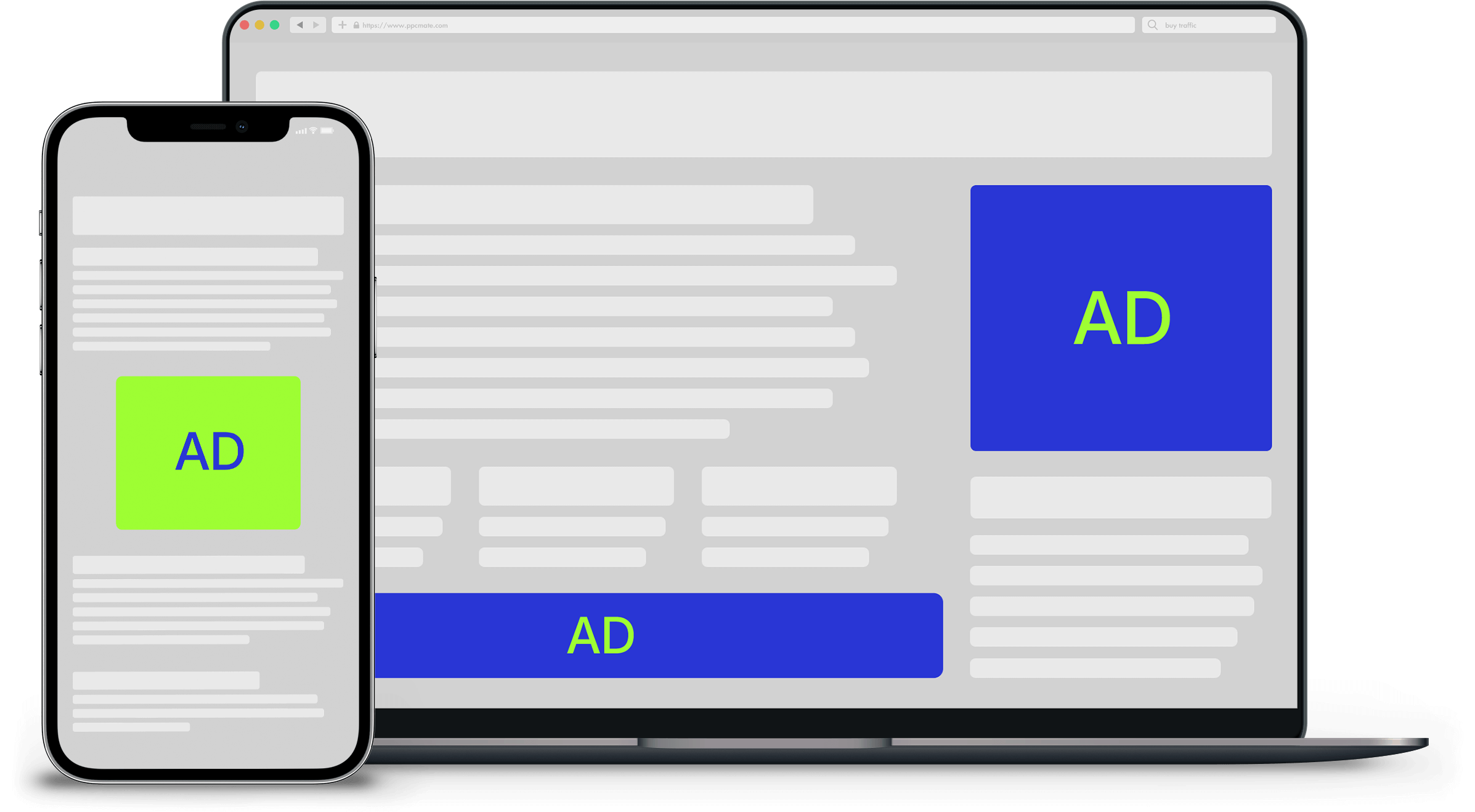
Banner sizes tend to run in several standard dimensions, depending on where you are placing them. Google AdSense ranked the best performing ad sizes and locations. They include:
- Leaderboard – 728×90
- Half-Page – 300×600
- Large Rectangle – 336×280
- Medium Rectangle – 300×250
- Large Mobile Banner – 320×100
While there are other sizes supported, these are the five that tend to show the best results. Which one works for you will be based on your targets and designs. Some ads will require more vertical space. Others more horizontal. Some will need a more balanced look while for others, a thin strip will do.
Make sure you are picking the best for your purpose.
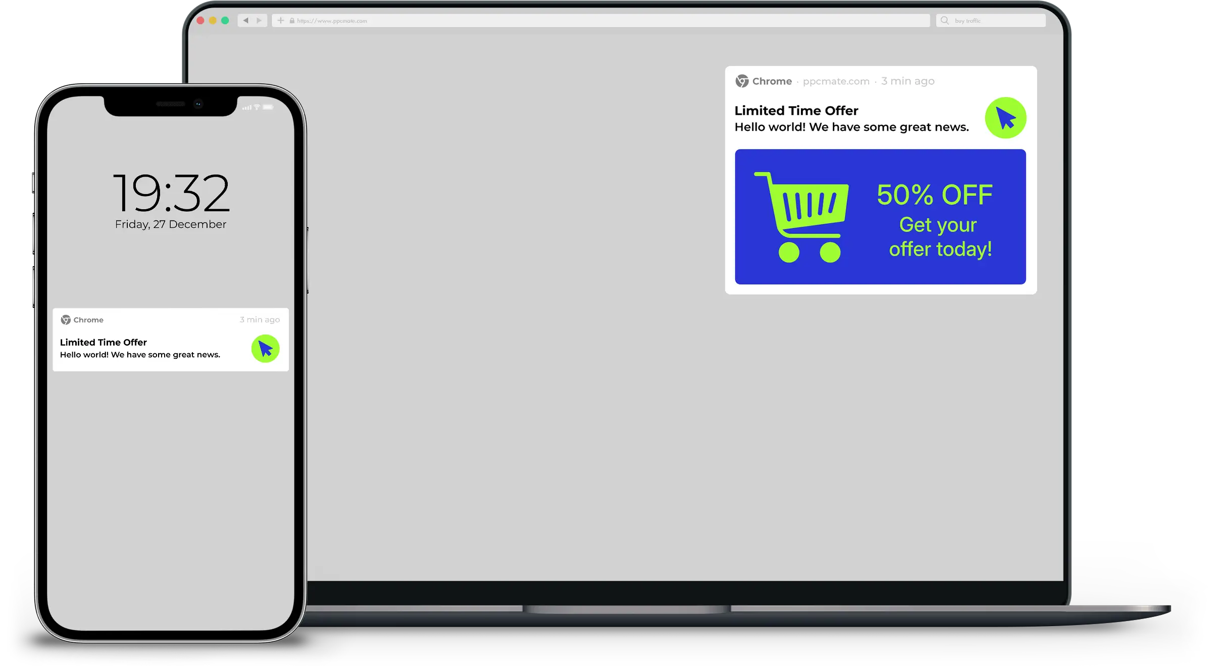
Know the three B’s: brand, buzz and badger.
On most advertising design articles, you’ll read about the hierarchy of an ad. The way I learned about this concept was actually through the three B’s.
First, you have brand. This is the incorporation of your logo somewhere on the ad, which is a must for anyone promoting a product of any kind. It should be one of the first elements the viewer sees in the ad.
Second, there is buzz. This requires using a word that really stands out and gets people interested. Free is a popular and effective one, such as “free trial” or “limited time offer.”
Third, there is badger. No, it isn’t the small animal. It is pushing people into clicking on your link, through a call-to-action (CTA). The buzz can help reinforce this badgering by placing a sense of urgency on the viewer.
Pick the right tool.
The good news is you don’t need to hire a graphic design company to create an effective banner ad. You don’t even need any expensive software.
Today, we’re lucky to have online tools that can handle everythingfrom concept to design.
One of the most powerful players in banner design is BannerSnackwhich recently launched a new banner creator, which provides a lot of tools to design an effective banner ad.
Never underestimate the power of a CTA.
Spend some time coming up with an effective CTA. A/B test several CTA versions to identify the best performing one.
It isn’t enough to just present an ad with information on your product or brand. No matter how well designed and carefully laid out, if you don’t give some indication that you want them to click it, they probably won’t.
Keep it simple, stupid.
Because of how little space you have at your disposal, the space in an ad is at a premium. Placing too much within its borders is a sure way to screw up the entire design. No one likes overcrowding, and yet you so often see businesses using busy ads in an attempt to draw you in.
You want your banner ad to be clean, simple, and get the message across. Remember: Keep it simple, stupid.
Consider moving images.
When you have the money to spend, having a moving ad is a great way to catch people’s eye, and leave an impression. Animated video ads are becoming increasingly popular, and slideshows have been a staple of banner ads for a while now.
These tend to be more expensive, but it’s worth spending more on an ad that is going to make a bigger impact. This campaign is good example.
In single slide ads, consider skipping the image.
Of course, images aren’t always a good idea. When you only have a single slide ad that remains stationary, you are limited in your space. So you may want to remove all images except your logo.
Test, tweak, and try again.
All of these tips are helpful, but they aren’t a magic formula. You are going to have to find what works for you through good old fashioned trial and error. A/B testing is a safe bet. Once you have your results, make a few tweaks; try again, then test again.
Over time you will find that your ads get stronger and become more effective. You just have to make sure you never stop trying to improve. No matter how good your results are, don’t forget that they can always be better.
___
by ANN SMARTY
source: Entrepreneur