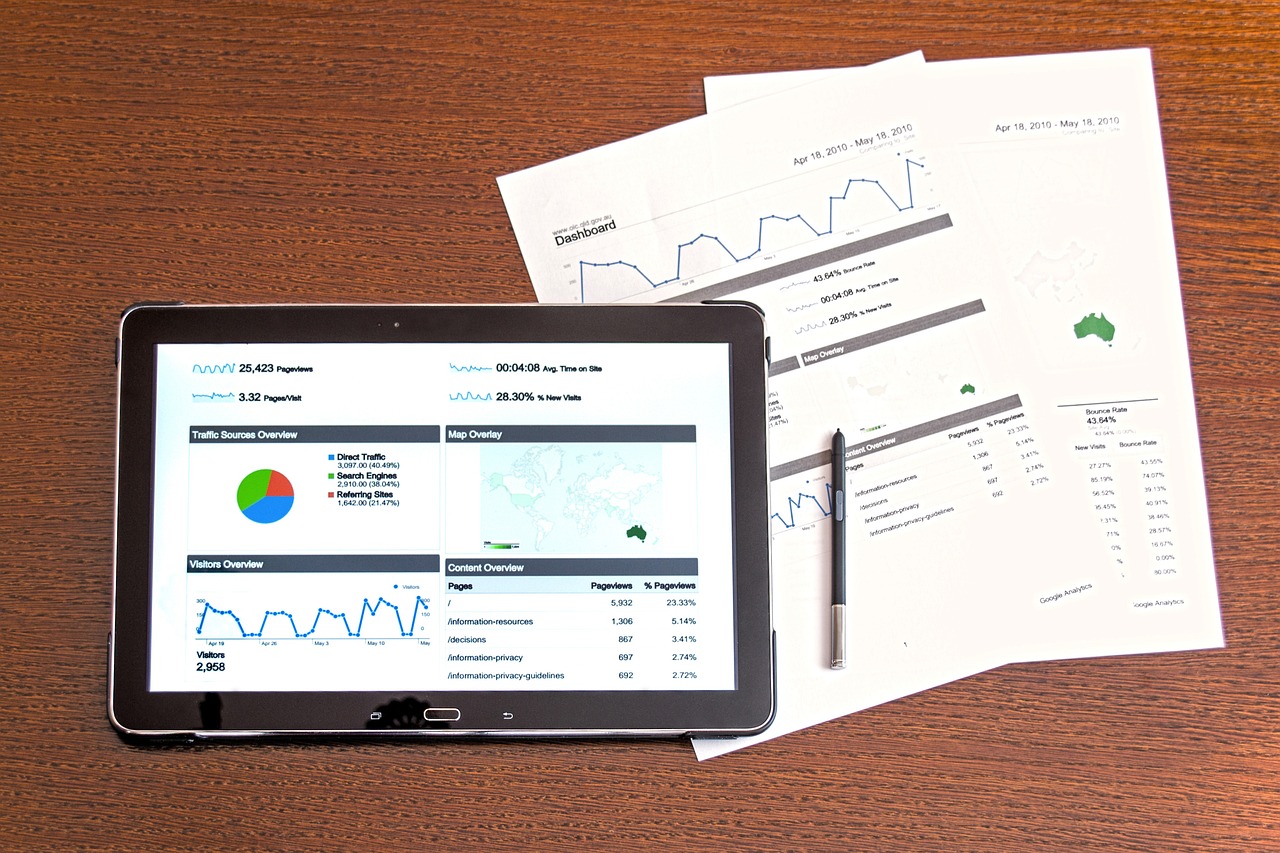
The design and functionality of your website can become your best marketing tool and a major factor in whether your business fails or succeeds online, and to what extent. Thanks to cheap domain names and hosting, there are thousands of business pages on the digital space all competing for the attention of online surfers with the end goal that they will take action and purchase the advertised product or service. But, very few sites are able to achieve this key objective, boost Web traffic and repeat visit rates. Here are proven strategies that will increase general user experience and accelerate the business goal of your website.
Develop Good Content
The biggest let down of a business website is content that is poor, placid and uncreative. If you are going to successfully market your idea or product on your website, you must piece together great narratives, descriptions and images that combine well to create persuasive, fluid and easy-to-understand content.
Spotlight Your USP
Like in any other body of text, content does not carry the same weight, and some pieces of information are more important than others. If content on your page is important, make it obvious to the visitor. You should prioritize key content and pages to boost your website functionality and user experience. And don’t forget to always follow the KISS principle: Keep It Simple and Smart (KISS) and avoid clutter and aimless navigation.
Go Mobile
Mobile surfing is a huge feature of our everyday living today, and users are more likely to first see your page on their Smartphone over any other devices. Investigate the percentage of Web users who are likely to access your website on their mobile phones. If it is high, build a separate mobile version of your website or even an app. If it is low, you may not need a mobile version of your webpage — but make sure your website functionality works well on Smartphones too.
Check the Competition
You sure want to be at or near the top of the market pyramid. If you want to be the best, then you need to beat the best or at least be like the best. Before you construct your website, see what your biggest competitors are up to. If you like the look and feel of their webpage, note key points with the aim to replicating the concept, modifying specific elements and making it your own. Or you can simply improve on the whole concept.
Utilize the Power of Big, Concise and Creative Headlines
Studies on Web usability show that big, powerful websites are the most viewed content, even over images. Users need to quickly process and sift the gamut of information on the web. In consequence, their eyes will naturally shift to the big text and numbers on your page. You want them to notice the summary or the most important information on your site. This is now a common design trend on the homepages of many companies.
Give Users a Call to Action
Humans, by natural inclination, urgently seek closure on anything that engages their attention. When users visit your page, don’t keep them hanging. Let them quickly know why they are there and what actions they need to take to enjoy the benefits of the product or services advertised on your page. And don’t just say, for example, that you are giving them a ’50 percent off the cost,’ tell them to ‘CLICK HERE’ or any other action you want them to take so as to take advantage of the discount.
Choose the Right Colour
As in other natural contexts, color has a psychology in the way humans perceive what it is associated with. For example, the color that stands out on your webpage could be affected by the demography of your primary target audience, whether it is intended for children, women, men, young adults or senior citizens.
Also, according to a cognitive research about a phenomenon known as the Von Restorff effect, the effect of color on our perception predicts that whatever is distinct, gets recognized and memorized easily, and whatever blends in is ignored.
Make it ‘Fitt’
The Fitt’s Law, when applied to web design, states that a user is more likely to be attracted to and use a target object on your page if it is the biggest and closest to the startpoint. You can improve your webpage functionality and usability with Fitt’s law by enlarging the most important elements or most commonly used buttons, thereby creating a visual hierarchy.
Explore White Space
White space is an important web design tool that should be exploited to improve content comprehension and contrast with other Web elements. According to Web research by Eyetrack II, reading comprehension decreases sharply when you reduce white spaces from the margins.
This is true for every spot on your webpage that is heavy on text, like product descriptions, blog posts and landing pages. Your typography should be properly spaced and easy on the eye, so users can quickly process and digest your message.
Direct the User’s Eye
An Eye Gaze study says we just cannot ignore following the lead of another person’s gaze or where an arrows points. So, if you have an image of a person on your webpage, the user’s eye will naturally be drawn to follow the lead of the image and look at where it focuses. Consequently, the image and the way it is positioned can distract from or boost the message on your page. You should use this psychology to direct the user’s eye and control what you want them to see first.
Believable Testimonials
Giving your business prospects social proof about your service or product is important, but don’t water down the effect of testimonials and reviews on your page by making them look like they are staged, fake or commonplace. Remember too that you must first have created a strong, persuasive message on why the user should try your product or service.
If you must have testimonials and reviews on your page, ensure they are specific and testimonies your users can really relate to. It is also important that your business has already built some credibility and a good customer base; if not, leave out testimonials until a time when your website can make a good showing.
Accelerate Load Time
Fewer things can be more frustrating and constitute a big turn off than a webpage that loads too slowly. No one likes it and you’ll be lucky to get a repeat visit by a user that gets such awful experience. On the reverse, the effect of quick loading time on your webpage is amazing, and you’re likely to see an explosion of Web traffic stats, particularly if your site is easy on the eye, market-tailored and has great functionality. According to a study by Google Search and Microsoft Bing, slow pages lose users. Specifically, a less than two-second delay in page responsiveness will reduce user satisfaction by 3.8 percent and cause loss in revenue by 4.3 percent.
___
by David Fournier
source: SiteProNews